Over the past couple of weeks I've prototyped a new API for plotting in JavaScript. You might rightly wonder why I've done this? Surely there's already enough JavaScript visualization libraries in the wild?
Well if you read my previous posts on plotting charts in JavaScript or otherwise have your own experience, you'll know that munging the data and configuring the chart can be a tedious and error-prone process. I do quite a bit of JavaScript-based exploratory data analysis and I seem to be constantly setting up and configuring charts.
I've been on a drive to reduce the cost of experimentation in my work and so I needed to be able to easily create charts with an almost effortless API that worked well with Data-Forge and had full support for intellisense in Visual Studio Code to help streamline my workflow and enable super-fast prototyping.
So I've created a new API for plotting in JavaScript which is convenient, not tedious and can produce both static and interactive charts from your data.
Please allow me to introduce my newest open-source library: Data-Forge Plot.
How simple is it? See for yourself, load a CSV file and render a chart like this:
const dataFrame = await dataForge.readFile("my-data.csv").asCSV();
await dataFrame.plot().renderImage("my-chart.png");
Wow! Thats one line of code to load the data file and another to plot and render the chart to an image! Has it ever been so easy to produce a nice looking chart from a CSV file.
It's also simple to export an interactive web-visualization that you can then host under a web-server of your choice:
await dataFrame.plot().exportWeb("my-web-vis");Data-Forge Plot works with Data-Forge and makes it easy for you to get your data into a chart with minimal fuss and with little to no configuration. Please read on to learn more about this exciting new API.
It's early days for Data-Forge Plot - it's no where near complete. It's basically now at the proof of concept stage, but already it is very functional, very useful and you can try it for yourself. I'm using this blog post not only to announce Data-Forge Plot, but also to ask you to give feedback.
In a moment we'll do a walkthrough of an example use case and I'll explain how to use the new API. Please comment or email and let me know if this API works for you! Please let me know if you think it can be improved. This API is still evolving, there's more work to be done and I'll appreciate your feedback on it.
Why?
Before we get into the good stuff, I need to more fully explain why I've built Data-Forge Plot.
These are my reasons:
- I needed an API to help power my data analysis and exploratory coding in Node.js. Data-Forge + Data-Forge Plot make for a powerful data analysis combination.
- I need a charting library where I can separate the chart definition, the data and the axis map (which I'll explain later). In some of my apps I need to have a library of charts that I can reuse and keeping the different aspects of chart configuration separate has helped me reuse charts with different data.
- Simplicity. I like to do fast paced prototyping, so I need an API that can create nice looking charts quickly.
- Flexibility. Although I want to start quickly and simply I also want to be able to configure and tweak the chart when that's necessary.
- Although I love fluent APIs, there are also plenty of situations where I'd like to be able to instantiate a chart just from a data definition. So Data-Forge Plot has two types of interface: a fluent API that works well with Visual Studio Code intellisense, but charts can also be created from a data configuration. Chart configurations can also be exported after being created with the fluent API. So I can start with the convenience and nice workflow of the fluent API and work towards a data-driven chart (that I can later add to my chart library).
- It's incredibly useful to be able to render charts on the server-side.
It's important to note that I'm not just reinventing the wheel here. What I'm doing is building on the work of others, integrating it with Data-Forge and building an API that is hopefully friendly to use and fulfills the needs of those wanting to do their data analysis in JavaScript.
Getting the example code
I've prepared a small example so you can follow along with this blog post. You'll need Node.js installed to run this. You should download the example code, unpack it locally on your dev PC then run npm install in the same directory to install all the dependencies.
You can now run the code example by running:
node index.jsLet's go through this example code bit by bit and understand how Data-Forge Plot is used.
Walkthrough: Acquiring Microsoft stock history and plotting a chart
We will use request-promise to pull Microsoft's stock price history from Alpha Vantage. We'll then plot the stock's closing prices using Data-Forge Plot. After that we'll compute a simple moving average (using my other library Data-Forge Indicators). Finally we'll plot a chart with both closing price and the simple moving average, then we'll export that to an interactive web visualization!
First we need to get our data. We'll use the Alpha Vantage demo API key and get the Microsoft stock history via HTTP GET from their API. This is a pretty common usage of Data-Forge:
const url = "https://www.alphavantage.co/query?function=TIME_SERIES_DAILY&symbol=MSFT&apikey=demo&datatype=csv";

const response = await request(url); // Request the data from Alpha Vantage.
const df = dataForge
    .fromCSV(response, { dynamicTyping: true }) // Deserialize CSV data.
    .parseDates("timestamp", "YYYY-MM-DD"); // Parse dates from strings.

console.log("Retreived:");
console.log(df.head(10)
    .toStrings("timestamp", "YYYY-MM-DD") // Formatting for display.
    .toString()
);
Once we get the data back we'll load it up into Data-Forge and print out a sample of it to see how it looks:
Retreived:
__index__  timestamp   open      high      low      close   volume
---------  ----------  --------  --------  -------  ------  --------
0          2018-06-15  101.51    101.53    100.07   100.13  65738585
1          2018-06-14  101.65    102.03    101      101.42  25691811
2          2018-06-13  101.72    102.01    100.56   100.85  29492875
3          2018-06-12  101.1     101.4493  100.75   101.31  18325228
...
We might also save the data to a CSV file so we can inspect it separately or reuse it in some other way:
await df.asCSV().writeFile("MSFT.csv");Please be aware that if you are trying to get data from Alpha Vantage for companies other than Microsoft then you'll have to use your own API key. It's a free service and you can sign up here.
Plotting a default chart
Now that we have some data to play with let's make a chart. Data-Forge Plot is an extension to Data-Forge. Requiring it into your script adds the plot function to the Data-Forge Series and DataFrame classes:
const dataForge = require('data-forge'); // Load Data-Forge.
require('data-forge-plot'); // Extend Data-Forge with the 'plot' function.
Now let's reverse the dataframe (putting it in forward chronological order), index the dataframe and then extract the closing price time series from the dataframe:
const chronoOrder = df.reverse();

// Use the date as the index of the dataframe.
const indexedDf = chronoOrder.setIndex("timestamp");

// Extract the closing price time series.
const close = indexedDf.getSeries("close");
Indexing our dataframe serves two purposes. Firstly when we plot it in a moment the index will automatically serve as the x axis for the chart. In addition we need to index to merge data, something we'll need soon.
Now we are ready to plot our chart. Let's plot the closing price time series and render the chart to a PNG file:
await close.plot().renderImage("./MSFT-close.png");The plot function returns the plotting API. This is a fluent API that we can use to configure the chart. In this case though we are just using the default chart configuration and calling renderImage to render the chart to an image. Here's one I prepared earlier:
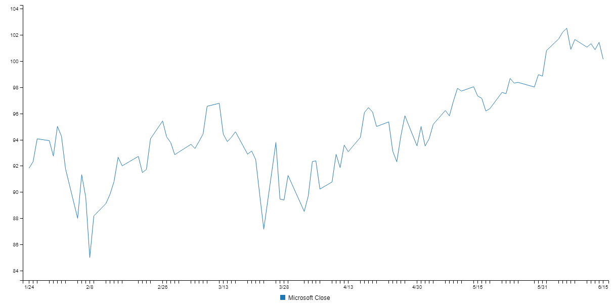
We called plot with no parameters and we didn't have to do any tedious configuration to produce the chart. Nice!
Actually, that's not quite the truth, to render that chart I did make a small tweak. When we extacted the close series from the dataframe we lost the name of the column. So I've had to manually set a label for the axis, here's the modified code:
const plot = close.plot({}, { series: { close: "Microsoft Close" }});
await plot.renderImage("./MSFT-close.png");
Computing and plotting a simple moving average
Let's make the example a bit more interesting. We'll compute a simple moving average (SMA), merge the result back into the original data and then plot both the closing price and the SMA to a chart.
We'll compute the moving average with the sma function from my other new work-in-progress library Data-Forge Indicators:
const sma = close.sma(30); // Compute a 30 day simple moving average.Again we print the result to the console so we can inspect the result and check that the moving average was computed as expected:
SMA:
__index__  __value__
---------  -----------------
0          92.08633333333334
1          92.17333333333335
2          92.31366666666668
3          92.40400000000001
...
It's looking good!
Now we can merge the orginal dataframe and the SMA. This merging works because we indexed our dataframe earlier:
// Merge the sma into the original data.
const merged = indexedDf.withSeries({ SMA: sma });
Again we output a sample of the merged data to check that all is well:
Merged:
__index__  timestamp   open   high   low     close  SMA
---------  ----------  -----  -----  ------  -----  -----------------
0          2018-03-08  94.27  95.1   93.765  94.43  92.17333333333335
1          2018-03-09  95.29  96.54  95      96.54  92.31366666666668
2          2018-03-12  96.5   97.21  96.04   96.77  92.40400000000001
3          2018-03-13  97     97.24  93.97   94.41  92.42033333333333
...
See how we have integrated the SMA column into our dataframe? Note that I dropped the volume column, just so that the output would all fit neatly when presented on this page.
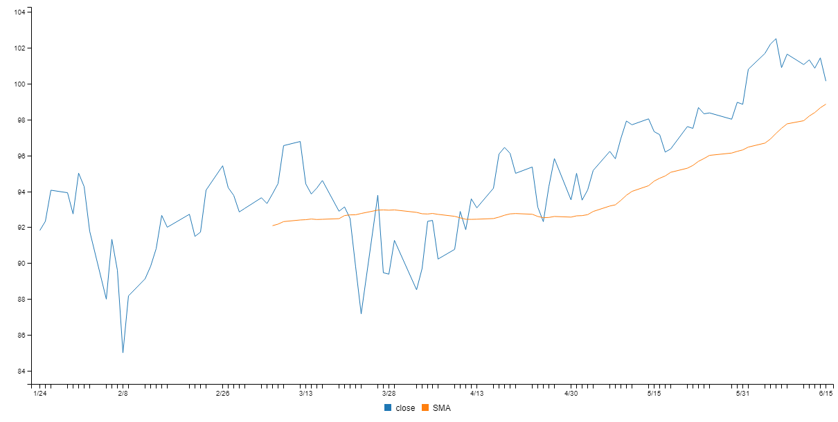
Now that we have our merged data set, let's plot a chart with multiple series:
const plot = merged.plot({}, { y: ["close", "SMA"] });
await plot.renderImage("./MSFT-sma.png", { openImage: true });
Here we are passing some inputs to the plot function to configure it. Specifially we are telling it which columns in the dataframe to include in the y axis. If we didn't do this, all the columns would automatically be included (and that would make for a messy chart). This is a basic example of data-driven chart configuration.
Check out the configuration passed to the renderImage function and how the openImage field is set to true. This is a small convenience that automatically opens the rendered imaged in your default image viewer. Run the code and the chart pops up in front of you. Small automations like this help streamline your workflow and makes your iterations that little bit faster.
Here's the rendered chart with both the closing price and the moving average:
Exporting an interactive web visualization
We aren't just stuck with static rendered images. We can also export an interactive web visualization, we just need to adjust our code slightly:
await plot.exportWeb("./test-export", { openBrowser: true });Here we pass in configuration and use the openBrowser field to automatically open the exported web visualization in our browser! Here's an interactive visualization I exported earlier and then embedded in this page using an iframe. Hover your mouse over the chart to see what happens:
<iframe width="650" height="250" frameborder="0" src="/content/web-export/index.html" style="display:block; margin: 0 auto;"> </iframe>Have you ever built an interactive web visualization this quickly before in JavaScript? This visualization can be hosted under any web-server or embedded (as I have done here) within a page.
Exporting a Node.js project
We can also export a Node.js project to host our web visualization!
await plot.exportNodejs("./test-export-nodejs");The end result is a Node.js project with a simple web-server to host our interactive visualization and a built-in REST API to serve our data. Either the exported web visualization or the exported Node.js project can be a great starting point for you to build on to create a more sophisticated visualization.
Configuring your chart
We can configure our charts either by passing configuration to the plot function or using the fluent API that is returned by the plot function.
Data-driven chart configuration
Let's now see an example of configuring the chart through data:
const plot = df.plot(
    // Chart definition:
    {
        width: 1200,
        height: 300
    },
    // Axis map:
    {
        x: "some-series",
        y: "another-series"
    }
);
await plot.renderImage("output.png")
In this example we are passing two configuration objects to the plot function. The first is the chart definition. Here we can set the dimensions of the chart and provide other configuration such as the type of chart (line, bar, etc).
The second configuration object passed to the plot function is what I call the axis map (for want of a better name). This maps each data series to the axis' on which it should be rendered in the chart.
Keeping the data, the chart definition and axis map separate makes it easier to reuse charts. For example you might want to reuse your chart definition and plug in different structured data. Or maybe even reuse the chart definition and the axis map, but plug in new data that has the same structure. The separation of data and configuration means we can maintain a library of resuable charts.
Fluent API chart configuration
As an alternative to the data-driven configuration we can also use the fluent API which works really nicely with intellisense in Visual Studio Code to give us a helping hand putting together a chart, here's an example:
const plot df.plot()
    .width(1200)
    .height(300)
    .x().series("some-series")
    .y().series("another-series");
await plot.renderImage("output.png");
The result is basically the same as before, but under the hood Data-Forge Plot has filled out the chart definition and the axis map for us.
After using the fluent API to prototype your chart you might then want to export the chart definition and axis map so that you can save and reuse them:
const chartDef = plot.exportChartDefintion();
fs.writeFileSync("my-chart-def.json", JSON.stringify(chartDef, null, 4));

const axisMap = plot.exportAxisMap();
fs.writeFileSync("my-axis-map.json", JSON.stringify(axisMap, null, 4));
How does it work?
Data-Forge Plot builds on my previous work in server-side rendering that I've blogged about on CSS Tricks. I've also dedicated a whole chapter to this technique in my book Data Wrangling with JavaScript, that's how important I think it is.
Under the hood Data-Forge Plot uses the C3 charting library to do the actual visualization. I really like C3 and that's why it's my first port of call when building Data-Forge Plot. However in the future I'd also like to support other charting libraries...
What does the future hold?
Like I said, it's early days for Data-Forge Plot and there's so much more I want to do, including:
- PDF rendering.
- Templates for other charting libraries.
- Templates for other export types.
Can you contribute?